
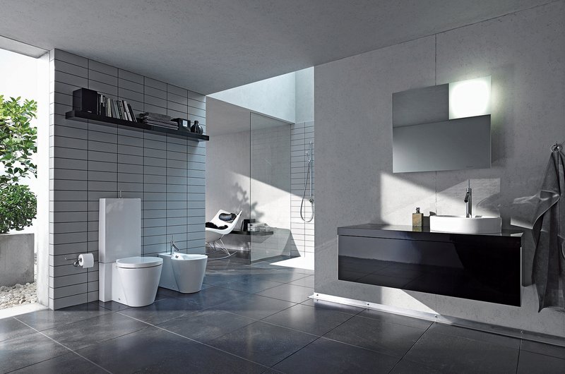

The bathroom has long transitioned from a purely utilitarian space into a sanctuary of personal expression and architectural prowess. While soft neutrals and monochromatic palettes have dominated the design landscape for years, a new era of bold, high-contrast aesthetics is taking center stage. High-contrast design is not merely about using dark and light colors together; it is a sophisticated play on visual tension, balance, and the strategic use of materials to create a room that feels both dynamic and grounded. When executed correctly, a high-contrast bathroom does not just serve a function—it commands attention and leaves a lasting impression.
By utilizing the sharp juxtaposition of light and dark tones, homeowners and designers can manipulate the perceived dimensions of a room, highlight architectural features, and introduce a sense of drama that softer palettes cannot achieve. This design philosophy relies on the principle that the eye is naturally drawn to areas where light and dark meet. In a bathroom, where clean lines and hard surfaces are the norm, this tension can be used to define zones, accentuate luxury fixtures, and create a spa-like atmosphere that feels contemporary and timeless.
The Foundation of Black and White: The Ultimate Contrast
The most iconic manifestation of high-contrast design is the classic black-and-white palette. This combination is essentially foolproof because it relies on the absolute ends of the color spectrum. However, a modern high-contrast bathroom goes beyond white subway tiles and black grout. It utilizes these tones through varying textures and scales to prevent the space from feeling flat or clinical.
In a high-contrast setting, white often serves as the “negative space” that allows the black elements to pop. For example, a crisp white freestanding tub set against a feature wall of matte black vertical tiles creates an instant focal point. The sharp silhouette of the tub is accentuated by the dark backdrop, making the fixture appear more like a piece of sculpture than a plumbing item. Conversely, using large-format white marble with heavy black veining provides a natural, organic way to introduce contrast while maintaining a luxurious, high-end feel.
Strategic Use of Matte Black Hardware and Fixtures
One of the most effective ways to introduce high contrast without committing to dark walls or floors is through the strategic selection of hardware and fixtures. Matte black has emerged as a dominant finish in contemporary bathroom design specifically because of its ability to create “visual punctuation.”
When matte black faucets, showerheads, and towel bars are placed against white tile or light-toned stone, they act as anchors for the eye. This creates a sense of rhythm throughout the room. To successfully command attention with hardware, it is essential to maintain consistency. If you choose matte black for the vanity faucet, ensure the shower trim, mirror frames, and even the toilet flush lever share the same finish. This uniformity creates a cohesive narrative that feels intentional rather than haphazard.
Incorporating Natural Elements to Soften the Tension
While high-contrast designs are meant to be bold, they can occasionally feel “cold” if they rely solely on hard, synthetic surfaces. Professional designers often introduce natural wood tones to act as a bridge between the light and dark extremes. This is frequently referred to as “Warm Minimalism” within a high-contrast framework.
A floating vanity made of rich walnut or light oak provides a necessary organic warmth that balances the severity of black-and-white tiling. The grain of the wood adds a third dimension of texture that prevents the room from feeling like a digital rendering. Furthermore, natural stone with warm undertones, such as travertine or limestone, can be used alongside black accents to create a high-contrast look that feels earthy and grounded rather than stark and industrial.
Lighting: The Invisible Element of Contrast
In a high-contrast bathroom, lighting is not just a functional requirement; it is a critical design tool. Because dark surfaces absorb light and light surfaces reflect it, the placement of fixtures determines how the contrast is perceived.
-
Backlit Mirrors: Placing LED strips behind a mirror creates a halo effect that can make a dark-framed mirror appear to float against a light wall, adding depth and a futuristic touch.
-
Recessed Niche Lighting: If you have a dark-tiled shower, adding a small, warm-toned light inside a recessed niche can highlight the texture of the tile and prevent the dark corner from looking like a void.
-
Pendant Lighting: Using a singular, bold pendant light in a dark finish can break up the verticality of a white-tiled room, drawing the eye upward and emphasizing the height of the ceilings.
Pattern Play and Geometric Tension
Contrast is not limited to color; it can also be achieved through the juxtaposition of different shapes and patterns. A common technique in high-contrast bathrooms is the use of “scale-shifting.” This involves pairing small, intricate patterns with large, expansive surfaces.
For instance, a floor composed of small black and white hexagonal tiles can be paired with large-format white wall panels. The busyness of the floor is anchored by the simplicity of the walls, creating a balance that feels curated. Another popular method is the use of “book-matched” stone, where two mirrored slabs of heavily veined marble are placed side-by-side. The symmetrical, high-contrast patterns created by the natural veins act as a biological masterpiece, commanding immediate attention the moment one enters the room.
The Role of Negative Space and Minimalism
A frequent error in high-contrast design is overcomplicating the space. To truly command attention, the contrast needs room to breathe. This is where the concept of negative space becomes vital. By leaving certain areas of the room “quiet”—such as a plain white wall or an unadorned floor—you allow the high-contrast focal points to shine.
Minimalism in a high-contrast bathroom means every object must justify its existence. A single black vanity against an all-white backdrop is far more powerful than a room where every surface is competing for attention. The goal is to create a “visual hierarchy” where the most important elements of the room are highlighted by the highest levels of contrast.
Maintenance and Durability of High-Contrast Materials
Practicality is a major consideration when designing a high-contrast space. Dark surfaces, particularly matte black tiles and fixtures, are notorious for showing water spots, soap scum, and mineral deposits more clearly than their lighter counterparts. To maintain a bathroom that commands attention for the right reasons, material selection is key.
Opt for “forgiving” dark materials, such as slate-look porcelain or honed granite, which have natural variations that help hide daily wear. High-quality matte black fixtures with PVD (Physical Vapor Deposition) coatings are also superior, as they are more resistant to scratching and chemical damage from cleaning agents. By choosing durable, low-maintenance materials, you ensure that the high-contrast “wow factor” does not fade into a cleaning burden over time.
Frequently Asked Questions
Does a high-contrast design make a small bathroom look even smaller?
Contrary to popular belief, high-contrast design can actually make a small bathroom feel larger if used correctly. By using dark colors on the floor and lower half of the walls while keeping the upper half and ceiling a bright white, you draw the eye upward, creating an illusion of height. Additionally, using a dark “accent wall” at the far end of a narrow bathroom can add a sense of depth, making the room feel more expansive than it is.
How can I introduce high contrast without doing a full remodel?
You can achieve significant contrast through cosmetic changes. Replacing dated chrome hardware with matte black versions, painting a vanity cabinet in a deep charcoal or navy blue, and adding a high-contrast shower curtain or rug can transform the space. Even swapping out a standard mirror for one with a bold, dark frame can create enough visual tension to command attention.
Are high-contrast bathrooms trendy, or will they stay in style?
While specific patterns may come and go, the concept of high contrast—particularly the black-and-white aesthetic—is a foundational principle of design that has been around for centuries. It is considered a timeless choice because it relies on balance and clarity. To ensure your design stays relevant, stick to classic materials like stone, porcelain, and metal rather than overly “themed” decorative tiles.
What is the best way to clean matte black fixtures without damaging the finish?
Avoid using harsh abrasive cleaners, vinegar, or bleach, as these can strip the matte coating over time. The best method is to use a soft microfiber cloth with warm water and a drop of mild dish soap. Drying the fixtures immediately after use will prevent water spots from forming, keeping the finish looking crisp and dark.
Can high contrast work with colors other than black and white?
Absolutely. While black and white is the most common pairing, you can achieve high contrast with “near-blacks” like deep forest green, navy blue, or rich burgundy paired with cream, soft gray, or pale gold. The key is ensuring that the “Light Reflectance Value” (LRV) of the two colors is significantly different, creating that signature sharp transition between surfaces.
How do I prevent a high-contrast bathroom from feeling too industrial?
The “industrial” feel usually comes from a lack of organic texture. To avoid this, incorporate soft elements like high-quality cotton towels, a teak bath mat, or a piece of art with soft, flowing lines. Adding a few indoor plants can also break up the severity of the light-dark transition and add a layer of life and color to the space.
Is it difficult to coordinate different brands of matte black hardware?
Yes, it can be. Not all “matte black” finishes are identical; some may have a slight sheen, while others are completely flat. If possible, try to purchase your primary fixtures (faucet, showerhead) from the same manufacturer. For secondary items like towel rings or toilet paper holders, keep a small sample of your main finish to compare when shopping at other stores to ensure the tones are a close match.

Comments are closed.